
The Central New York Educational Heritage Collection

I'll be honest—when I first decided to create three custom rebinds for Potsdam Summerfest in New York, I was thinking purely aesthetically. Pick some nice colors, maybe use textures that looked interesting, slap on some vintage photos, and call it a day. After all, I was heading up to support my partner's band and figured this would be my first-ever in-person market. What could go wrong with choosing this absolutely insane venue for my debut?
But here's the thing about me: I can't just leave well enough alone. The more I thought about these three Central New York books, the more I realized I had an opportunity to do something special. I'd never even been to Potsdam or Syracuse, but that actually made it more interesting. I could approach these places with fresh eyes and really dig into what made them unique.
What started as "I'll just pick colors that look nice" turned into what I can only describe as the deepest research rabbit hole of my bookbinding career. Fifteen hours later, I emerged with a completely different understanding of these places and a newfound respect for the power of primary sources.
When I Accidentally Became a Geology Detective


The Potsdam rebind was where everything started to get interesting. I was brainstorming design ideas and did what any modern person does when they need inspiration: I googled "Potsdam NY." Buried in the search results was a casual mention that sandstone used to be the most commonly mined deposit in the area. That little tidbit made me think—what if I used a sandstone texture for the cover?
But once I started digging into that sandstone connection, I realized I'd stumbled onto something way bigger than I'd expected.
As I started digging through sources, I stumbled across something incredible: Potsdam's red sandstone wasn't just locally important. It was so geologically significant that when Ebenezer Emmons studied the rock formation in 1838, he named the entire formation "Potsdam Sandstone" after the town (Wikipedia, 2025a). Not some small local formation—the whole thing, across multiple states. Potsdam became what geologists call the type locality, the official reference point for this rock formation.
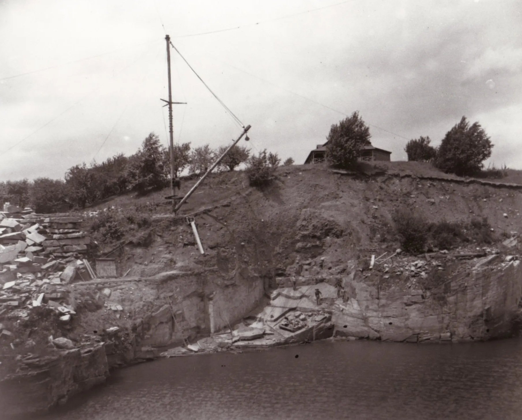
Sandstone Quarries Flooded
Courtesy of St. Lawrence University
I felt like I'd struck gold, but then I hit my first major fact-checking reality check. Multiple sources kept saying quarrying began in 1803, which sounded neat and tidy. But when I dug deeper into the Potsdam Public Museum archives, I found the real story: commercial operations actually started in 1809 (Potsdam Public Museum, n.d.). Captain Nathanial Parmeter had used local stone for his home around 1800, but systematic quarrying didn't begin until six years later. It was my first lesson in why you can't trust everything you read online, even when multiple sources repeat the same "fact."
The scope of this industry blew my mind. This local stone from a small town along the Raquette River ended up in Canada's Parliament Buildings and the Cathedral of All Saints in Albany (Wikipedia, 2025a). For 113 years, from 1809 to 1922, Potsdam was quietly supplying building stone for major construction projects across the Northeast. The industry only ended when dam construction flooded the quarry sites in 1922 (Potsdam Public Museum, n.d.).
And here's my favorite detail: Potsdam High School teams are still called the "Sandstoners" today (Sports Illustrated, 2023). I couldn't have invented a more perfect connection between past and present if I'd tried.
The Great Color Correction Disaster


If the Potsdam research taught me to dig deeper, the SUNY Potsdam research taught me why fact-checking can save your entire project. I'd done what I thought was due diligence and concluded that the school colors were burgundy and black. I was already mentally planning the binding when something nagged at me to double-check.
Thank goodness for that nagging feeling.
SUNY Potsdam's official school colors are maroon and gray—Pantone 1955 C and 429 C, to be precise (SUNY Potsdam, n.d.e). Not burgundy. Not black. Maroon and gray. I literally had to stop everything and redesign the entire binding because I'd been working off completely incorrect information.

Screenshot from the SUNY Potsdam Brand Guide
But while I was digging through their brand guidelines, I discovered something fascinating about the Minerva statue I'd planned to feature on the cover. The statue represents a tradition I'd never heard of before: many early teacher training colleges in New York used Minerva, the Roman goddess of wisdom, as their symbol for educating new teachers (ThoughtCo, 2025). SUNY Potsdam's statue stands in Minerva Plaza and continues this beautiful tradition of connecting wisdom with education.
The more I learned about SUNY Potsdam's history, the more impressed I became. Founded in 1816 as St. Lawrence Academy, it's one of America's first 50 colleges (SUNY Potsdam, n.d.a). But what really caught my attention was Julia Etta Crane's story. In 1886, she created one of the first programs specifically designed to train public school music teachers, launching what's now the world-renowned Crane School of Music (Crane School of Music, n.d.). Here was a woman pioneering music education over 135 years ago, and her legacy is still thriving today.
Syracuse and the Great Orange Discovery


By the time I got to Syracuse University, I was fully in research mode. I expected to find some interesting tidbits about their famous orange color, but I had no idea I was about to uncover what might be the most thoroughly documented color adoption in collegiate history.
The story of how Syracuse got their orange is absolutely wild. These weren't people who just woke up one day and said, "Hey, let's be orange." The university went through what I can only describe as a color identity crisis that lasted nearly two decades. They started with rose pink and pea green in 1872—can you imagine? Then they switched to pink and azure blue in 1873 (Syracuse University Athletics, n.d.). Each change was carefully recorded in Alumni Association minutes, like they knew future bookbinders would want to read about their color evolution.

Screenshot from Syracuse University’s “Campus Traditions” page.
The final change to orange in 1890 happened for the most relatable reason: peer pressure. After "cutting comments" from opposing teams about Syracuse's pink and blue colors during 1889 sporting events, the student body decided enough was enough (Syracuse University Athletics, n.d.). They formed a committee—because apparently even in 1890, you needed a committee to change school colors—and made a remarkable discovery: no other institution had claimed orange as their single official color (Syracuse University, n.d.b).
Syracuse became the first university to adopt orange alone, making them genuine pioneers in collegiate branding. But the choice wasn't random. The orange referenced New York's Dutch colonial heritage and the House of Orange flag that flew over New Amsterdam (later New York City) in 1625 (Wikipedia, 2025d). It was a deliberate nod to the state's history, making orange particularly meaningful for a New York institution.
The Hunt for the Perfect Images
While I was neck-deep in historical research, I was also trying to solve a completely different problem: getting the right images for the covers. I wanted to use the original photographs from the paperback covers, but that meant navigating the wonderful world of copyright permissions.
I reached out to both SUNY Potsdam and Syracuse University with what I thought were reasonable requests for permission to use their original images. The responses couldn't have been more different.
SUNY Potsdam never responded to my inquiries. I started with their online chat with a librarian service, but that led nowhere as it was staffed by someone from out of state (huh?). They said they would send an email/create a ticket on my behalf. I later emailed Special Collections myself, and basically got the institutional equivalent of radio silence. Turns out the entire Special Collections department is closed for the summer. Go figure. 🤷🏻♀️
Syracuse University, on the other hand, actually responded to my request. They took about 4 weeks to get back to me with a form I could fill out to get the scans and the attributions, which would then take another 3-4 weeks to get me the image files. At this point I only had two weeks until Summerfest and there was no way I was going to secure the high-resolution file in time. Though I'll admit, I'm already thinking about remaking that binding with the original image later for online sales 👀.
For the Potsdam rebind, I caught a break. I was able to use the original photograph from the paperback after the Potsdam Public Museum sent me a high-quality version. Turns out it's in the public domain, which made everything infinitely simpler. The images I ended up using for the university rebinds are also public domain: a 1922-1923 Syracuse cheerleaders photograph and a photo of a Minerva statue from elsewhere.


What Fifteen Hours of Research Actually Means

The whole process took over 15 hours spread across multiple types of sources. I found myself diving through university special collections and archives, cross-referencing USGS geological surveys with official government publications, combing through museum collections and local historical societies, reading contemporary 19th-century publications and records, and scrutinizing official institutional brand guidelines.
The most important lesson I learned? You absolutely cannot trust information just because it appears on multiple websites. Some "facts" I initially found repeated across dozens of sources turned out to be completely wrong when I checked them against primary sources. The 1803 vs. 1809 quarrying date was just the beginning. This is why going to original archives matters, even for something as seemingly simple as a book rebind.
Each design choice in these rebinds now tells a specific historical story. The sandstone texture honors a geological legacy so significant that scientists preserve it in official nomenclature. The maroon and gray colors respect SUNY Potsdam's actual institutional identity rather than some random color combination I found online. The Minerva statue represents a tradition of using wisdom symbolism in teacher education. The orange and navy celebrate Syracuse's pioneering role in collegiate color adoption.
When someone picks up the Potsdam rebind, they're holding something that physically references the stone that built Parliament buildings. The SUNY Potsdam binding uses the actual school colors that have represented the institution for decades. The Syracuse binding celebrates a genuine first in American higher education.
That's the difference between decoration and storytelling. That's what happens when you refuse to settle for "pretty enough" and insist on historically meaningful design.
Custom bookbinding creates objects that honor the stories they contain. These books may look pretty, but they’re also historically accurate tributes to the places and institutions they document. Every texture, every color, every design element connects directly to the actual history of Central New York.
And honestly? That feels pretty amazing to hold in your hands.
This research compilation is part of the Central New York Educational Heritage Collection, created for Potsdam Summerfest 2025. Each book includes a QR code linking to this detailed research breakdown, because every good story deserves its footnotes.
References
Crane School of Music. (n.d.). History - About The Crane School of Music. SUNY Potsdam. https://www.potsdam.edu/academics/crane/about/history
Potsdam Public Museum. (n.d.). Sandstone quarries. http://www.potsdampublicmuseum.org/subpages/74/84/23/sandstone-quarries
Sports Illustrated. (2023, November 6). Best high school mascot in New York: Top 10 candidates. https://www.si.com/high-school/national/2023/11/06/best-high-school-mascot-in-new-york-top-10-candidates
SUNY Potsdam. (n.d.a). Important information. Modern Campus Catalog. https://catalog.potsdam.edu/content.php?catoid=9&navoid=757
SUNY Potsdam. (n.d.e). SUNY Potsdam brand guide. https://view.publitas.com/suny-potsdam/suny-potsdam-brand-guide/page/1
Syracuse University. (n.d.b). Campus traditions. https://www.syracuse.edu/about/history/traditions/
Syracuse University Athletics. (n.d.). The Syracuse Orange. https://cuse.com/sports/2006/3/10/theorange
ThoughtCo. (2025). SUNY Potsdam photo tour. https://www.thoughtco.com/suny-potsdam-photo-tour-788565
Wikipedia. (2025a, June 21). Potsdam Sandstone. https://en.wikipedia.org/wiki/Potsdam_Sandstone
Wikipedia. (2025d, May 22). Syracuse Orange. https://en.wikipedia.org/wiki/Syracuse_Orange