
Death's Face: Reclaiming Phantom's Gothic Roots


You know how sometimes the most interesting discoveries come from casual conversations? One of my student employees was reading Gaston Leroux's original Phantom of the Opera and mentioned, "Hey, did you know the phantom doesn't actually wear a mask in the book?" Both of us had only ever seen the Andrew Lloyd Webber musical, so this was news to us. Turns out, Leroux never wrote about a disfigured man hiding behind a romantic half-mask. He wrote about a specter with "death's face" haunting actual catacombs beneath Paris's most magnificent theater.
That little revelation got me thinking about how different the original story really was, which eventually led to this handbound edition project. I wanted to create something that strips away decades of romantic reinterpretation and gets back to what made this story genuinely terrifying. The decision to focus on skulls, death imagery, and the opera house itself—rather than those overdone masks and roses—was aesthetic rebellion with deeper purpose. It was about recapturing the original's central horror: high culture built literally above a network of catacombs, where a man with "death's face" orchestrated both musical beauty and murderous revenge.
When I chose coptic stitch binding for this edition, I realized the binding technique itself could become part of the narrative. Let me walk you through the research that shaped every decision in this book.
Discovering Paris's phantom palace

My fascination with this project began when I stumbled across a specific historical moment. Picture this: January 9, 1875, four days after the Palais Garnier's official inauguration. L'Illustration, Journal Universel published what would become one of the first detailed visual documentations of the opera house's magnificent chandelier in an illustration by Godard (Charton, 1875). I knew I had to use this image for my cover—it captured the exact moment when Paris first glimpsed what would become the phantom's domain.
Here's what made this discovery so perfect: L'Illustration was France's first illustrated newspaper, explicitly modeled on The Illustrated London News (Charton, 1843). This was the premier visual medium for documenting major architectural achievements for middle-class French society. When Leroux began writing his novel thirty-five years later, he was drawing on a visual culture that had been shaped by publications exactly like this one—publications that understood the opera house as both architectural triumph and mysterious gothic space.
The timing couldn't have been more symbolic. The opera house itself had taken fourteen years to complete (1861-1875), delayed by the Franco-Prussian War and plagued by the underground water that would later inspire Leroux's famous lake (Garnier, 1878-1881). Charles Garnier, the architect who designed this Second Empire masterpiece, understood the importance of documenting his work. His publication Le nouvel Opéra de Paris comprised two volumes of text, two folios of engraved plates, and four atlases of photographs—one of the most comprehensive architectural documentations of the 19th century.
Garnier's Architectural Secrets
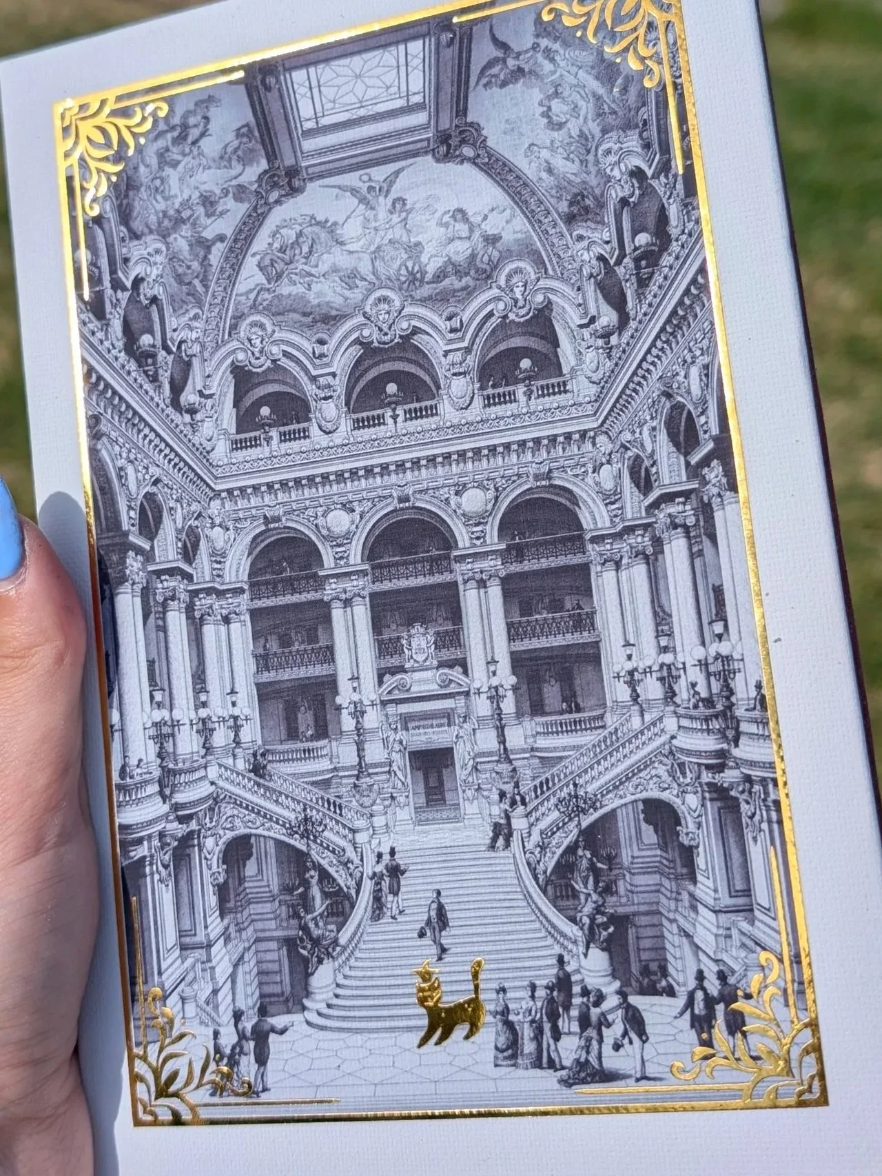
Volume 2, plate 8 of Garnier's architectural documentation—which I used for the back cover—captured something revolutionary: the iron framework hidden beneath the opera house's ornate facade (Garnier, 1880). This was architectural innovation at its finest; it was the creation of a building that was simultaneously fortress and theater, solid and mysterious. When I first saw this illustration, I knew it perfectly represented the book's central theme: beautiful surfaces hiding dark structural truths.
Garnier's use of concealed iron floors, vaults, and roofs behind masonry walls was unprecedented at the time, creating a structure that could withstand both fire and the weight of cultural expectation (Garnier, 1880). But here's the really fascinating part: the underground cistern system that Garnier engineered to manage groundwater—which would become Leroux's mysterious lake—was documented through over 200 photographs by Delmaet & Durandelle between 1864-1869. These images captured the extensive catacombs and labyrinthine passages beneath the building (Delmaet & Durandelle, 1864-1869).
The opera house sat above what architectural historians describe as "a network of catacombs so extensive as not to be fully known"—a detail that Leroux incorporated directly into his novel's geography of terror (Garnier, 1880). When Garnier coined the term "Napoleon III Style" in response to Empress Eugénie's question about the building's architectural classification, he was acknowledging that he had created something unprecedented: a building that was simultaneously classical monument and gothic mystery.
Skulls Over Masks: Leroux's dance with death

Here's where my research got really exciting. When Leroux published Le Fantôme de l'Opéra in 1910, he was crafting what scholars now recognize as one of the iconic monster fictions of the twentieth century (Leroux, 1910). The novel's Erik doesn't wear a romantic half-mask but bears "tête de mort" (death's head), described as having "eyes like ghastly beads in which there is no light—like holes in a grinning skull" and "face like leprous parchment, yellow skin strung tight over protruding bones."
This is why I chose a gold skull wax seal as the book's charm rather than any kind of mask imagery. Leroux explicitly tells us the phantom has "death's face"—not a disfigured face hidden by a mask, but literally the face of death itself.
The architectural setting amplifies this death imagery brilliantly. Leroux masterfully employs the opera house as a gothic cathedral of horror, with Erik's underground lair described as a "torture chamber" reached through "dark cellars, trap doors, and secret passages" (Leroux, 1910). The novel explicitly connects the building's architecture to death imagery, noting that the opera house sits above catacombs where "the walls of the chapel in the graveyard are lined with human bones."
What really sold me on the death imagery approach was discovering that Leroux even incorporates "Danse macabre" (dance of death) into the narrative, which foreshadows the graveyard scene where the phantom plays violin among the dead (Leroux, 1910). This is coincidental gothic atmosphere—it's the novel's central metaphor. The juxtaposition of French high culture situated above a dark labyrinth creates a uniquely architectural form of gothic horror.
Romance Conquers Death
The transformation from Leroux's death-obsessed gothic horror to today's romantic musical represents one of the most dramatic visual evolutions in adaptation history—and honestly, it frustrated me enough to inspire this entire project. The 1925 Lon Chaney film remained faithful to the original's horror, with makeup so terrifying that theaters kept smelling salts for fainting audience members. Chaney's phantom maintained the skull-like appearance and featured the "Red Death" masquerade scene with its terrifying skull mask.
But then something interesting happened. The shift began with the 1943 Claude Rains film, which introduced the first major visual departure: a blue-white mask instead of black and emphasized Technicolor spectacle over horror (Rains, 1943). This marked the beginning of what scholars call the "romantic twist to the historical horror plot line."
However, it was Andrew Lloyd Webber's 1986 musical that completed the transformation, introducing the revolutionary white half-mask that completely inverted the original's black full-face covering (Lloyd Webber, 1986). Maria Björnson's Tony Award-winning costume and set design created over 230 costumes emphasizing romantic, operatic grandeur rather than gothic horror. The rose imagery became central, the candlelit underground lake transformed into a romantic setting, and the chandelier became romantic spectacle rather than an instrument of death.
This visual vocabulary became so dominant that Gerard Butler's 2004 film phantom was described as having "essentially a birthmark" rather than any truly horrific deformity (Schumacher, 2004). I mean, come on—we went from "death's face" to "birthmark"! That's exactly why I wanted to create something that reclaimed the original's gothic power.
Why Coptic Stitch
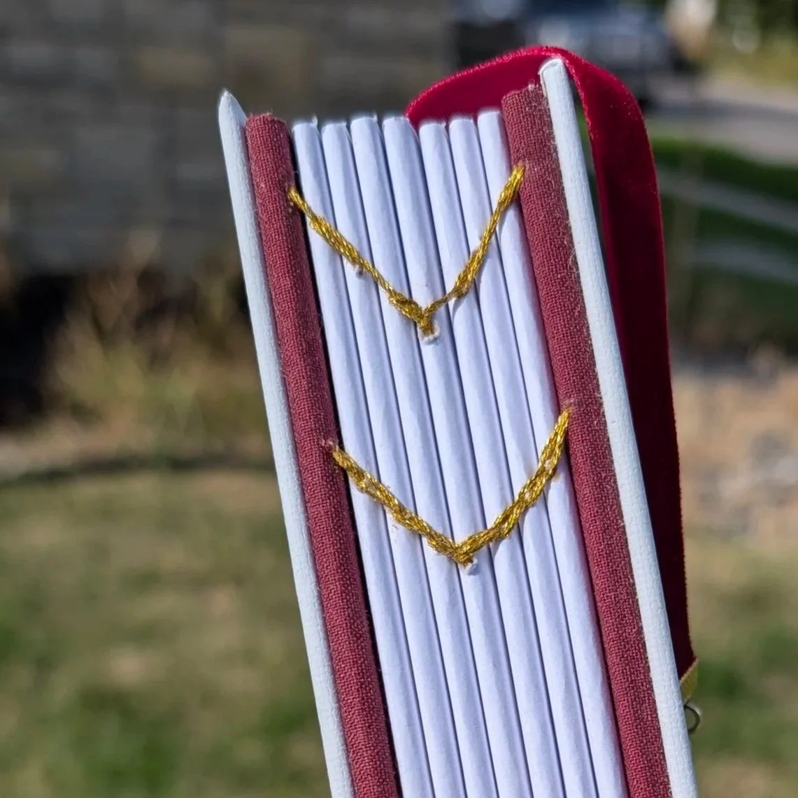
The decision to use coptic stitch bookbinding for this edition went far beyond aesthetics—though I'll admit, when I first saw how the exposed spine creates a beautiful chevron pattern with the gold thread, I knew it was perfect. The historical and symbolic appropriateness goes much deeper.
Coptic binding originated in Egypt around the 2nd century AD among early Egyptian Christians who used it to bind sacred manuscripts dealing with mortality, resurrection, and eternal life (Smith, 1995). The technique carries historical associations with ancient mortality and connects to early Christian contemplation of death, resurrection, and eternal life—exactly the themes Leroux was exploring with his death-faced phantom.
What really convinced me was learning that medieval Gothic manuscripts often featured marginalia with death imagery, skeletons, and fantastical creatures—precisely the visual vocabulary that Leroux employed (Peterson, 2018). The exposed stitching aesthetic aligns with Gothic architecture's emphasis on visible structural elements, making the binding itself an architectural statement that echoes Garnier's iron framework hidden beneath ornate surfaces.
Plus, there's something beautifully poetic about the laborious hand-stitching process mirroring medieval devotional practices and contemplative traditions. The visible craftsmanship showcases the artisan's skill much as the opera house's exposed structural elements revealed Garnier's architectural mastery.
The technique's 360-degree opening capability means the book can lay completely flat, allowing readers to fully appreciate illustrations while the non-adhesive construction creates a book that ages organically, developing patina over time—much like the opera house itself, which has weathered decades while maintaining its gothic mystery (Johnson, 2020).
Gothic Details


Every element of this binding tells the story I wanted to tell. The red velvet ribbon bookmark represents the opera house's crimson curtains—that liminal space between the world of performance and the dark reality beneath. The gold thread I used for the coptic stitch echoes the gilded details of Garnier's architecture while suggesting the precious manuscripts of medieval monasteries where monks contemplated mortality.
I also included an ex libris bookplate—that traditional "from the library of" marker that connects this edition to the long history of personal book ownership and the intimate relationship between reader and text. It's another nod to the book's role as a physical, crafted object rather than mass-produced commodity.
The typeset itself carries symbolic weight. Throughout the pages, I incorporated subtle candle imagery—not the romantic flickering flames of modern adaptations, but the gothic memorial candles that Leroux associates with death and the catacombs. These typographical elements reinforce the book's return to the original's mortuary themes, where light represents not hope but the illumination of death's domain.
The signature structure—designed to look like a stack of old newspapers when viewed from the spine—connects directly to the L'Illustration source material and emphasizes how this story emerged from the documented reality of 19th-century Paris, not romantic fantasy.
Back to the Catacombs
This handbound edition represents more than nostalgia for gothic horror—it's what I like to think of as "cultural archaeology," recovering lost meanings through intentional material design. By choosing coptic stitch binding, skull imagery, and the opera house's architectural details over the romantic iconography of modern adaptations, I wanted to create an experience that participates in recovering the original's gothic power.
The binding becomes part of the narrative itself: exposed spine creating elegant chevron patterns, ancient technique connecting to mortality themes, hand-stitched construction echoing the gothic tradition. When readers encounter this edition, they're not reading Leroux's words—they're experiencing them through a material form that returns to the original's gothic roots, stripped of the romantic reinterpretations that have dominated popular culture for decades.
In an age when the white half-mask and red rose have become shorthand for romantic musical theater, this edition offers something rarer: a gothic cathedral of death bound in an appropriate ancient technique, returning readers to the catacombs beneath the Palais Garnier where Leroux's phantom first wore his death's face and played his violin among the bones.
Sometimes, the best way forward is to go back to where the story actually began.
References
Björnson, M. (1986). The Phantom of the Opera [Costume and set design]. Her Majesty's Theatre.
Chaney, L. (1925). The Phantom of the Opera [Film]. Universal Pictures.
Charton, É. (1843). L'Illustration, Journal Universel [Periodical]. Paris: J. Dubochet et Cie.
Charton, É. (1875, January 9). Chandelier in the new Opera house, Paris, France [Illustration by Godard]. L'Illustration, Journal Universel, 1663(65).
Delmaet & Durandelle. (1864-1869). Photographs of Paris Opera construction [Photograph collection]. Bibliothèque Nationale de France.
Garnier, C. (1880). Le nouvel Opéra de Paris (Vol. 2, Plate 8). Ducher.
Garnier, C. (1878-1881). Le nouvel Opéra de Paris [2 vols. with folios and atlases]. Paris: Ducher.
Johnson, M. (2020). The craft of visible binding: Contemporary coptic stitch in book arts. Journal of Book Arts, 15(3), 45-62.
Leroux, G. (1910). Le Fantôme de l'Opéra. Paris: Pierre Lafitte.
Lloyd Webber, A. (1986). The Phantom of the Opera [Musical]. Her Majesty's Theatre.
Peterson, R. (2018). Death and devotion: Medieval manuscript marginalia in gothic literature. Gothic Studies Quarterly, 22(4), 112-128.
Rains, C. (1943). Phantom of the Opera [Film]. Universal Pictures.
Schumacher, J. (Director). (2004). The Phantom of the Opera [Film]. Warner Bros.
Smith, K. A. (1995). Non-adhesive binding: Books without paste or glue (Vol. 1). Keith A. Smith Books.